Why your website design needs to do more than just look good
So you run an online business, and you think your website design looks pretty good. But for some reason you can’t get people to stay on your website for very long, and you aren’t making many sales.
But why?
Or maybe you’ve built your own website, and you know the design isn’t that great, but your product is amazing, your services are top rate, and you really care about your customers. But you also don’t make many sales.
How come?
It’s because your website design is so important when it comes to actually turning viewers into customers.
And I’m not just talking about a website design that looks good. It needs to create a warm feeling, where your potential customer is put into a mind frame where they are wanting to buy.
Psychology Today has a great article on the psychology of why people buy which is well worth the read. If you can get inside your viewers mind, you can work out what it is they need from you before they are ready to purchase your product.
For those of you who want to know how this translates into website design, I’ve created a checklist of things your website design should or shouldn’t have to maximise your chance of gaining a new customer/client.
1. Your home page
Usually your home page will be the first thing someone sees when they land on your website. It is your first chance to draw your viewer in, and sell yourself.
[thrive_leads id=’87585′]
Keep these things in mind when creating your websites homepage:
1.1 Main header image
The most important part of your homepage is the main header image. This is where you make your first impression, and usually where someone will decide if they want to keep scrolling or leave.
The most important thing your header needs to have is a ‘call to action’. Below are two examples of home page headers.
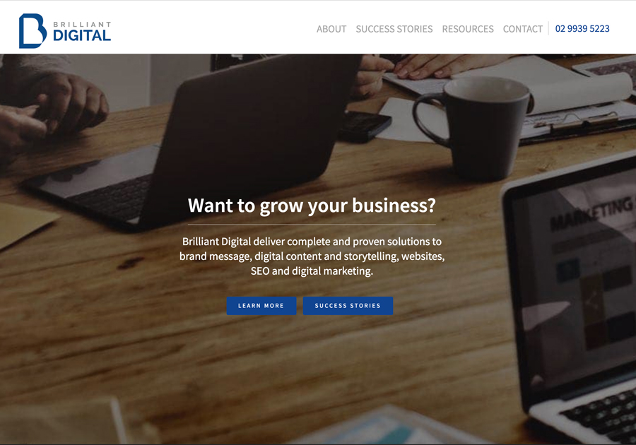
Brilliant Digital use a short and to the point headline to catch your attention. They then have two call to action buttons to choose from. The ‘success stories’ button is a great addition as it gives social proof that they can do what they are saying they can do.
This next home page header, whilst it looks nice, it doesn’t really draw the viewer in and doesn’t really excite the viewer enough to want to click the ‘view more’ buttons.
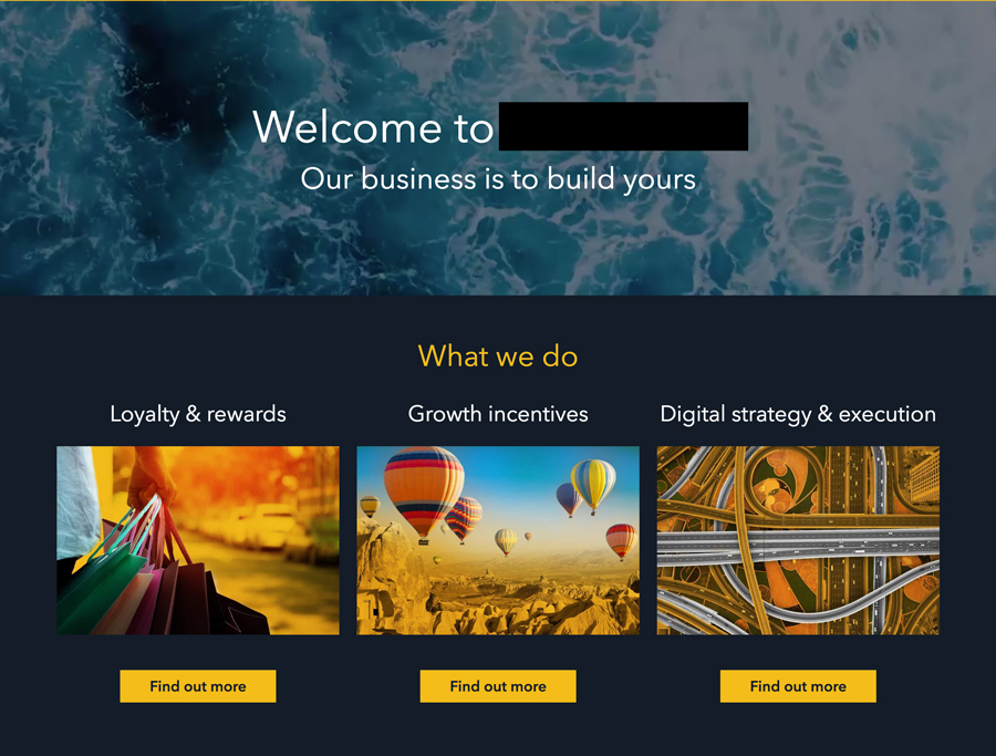
The other big difference between the two headers is that the first one is audience focused. Their focus is their viewers business, rather than speaking about their business.
A pretty picture as your header image is not enough to make sales!
Also, as tempting as it is to create a slideshow of images to get in as much information as you can, your best bet is to use just one image. Assume your audience is time poor, they don’t have time to sit and watch a slide show of images.
Instead, use your one best image as your header image, and then you can break up your home page with further images that are relevant.
1.2 Talk about benefits, not features!
A great way to sell your product or service is to talk about your customer.
Sounds kind of backwards right?
But think about it. Your audience is there to see what you can do for them. They want to know how your product or service will solve the problem they are having. How will it benefit their life?
Here’s an example of a description for gumboots that is feature driven:
– Made from rubber
– Yellow colour
– Sizes XS-XL
And here is a description that is benefit driven:
– These rubber gumboots will protect your feet from getting wet, whilst bringing brightness to a dreary day with their yellow colour.
– They come in a range of sizes so you can be comfortable as well dry!
Which one makes you want to buy the gumboots more?
Keep this in mind when creating the content for your homepage. As this is your first contact with your audience, you want to add as many benefits of your product or service as possible.
You can break up these benefits with images, recent blog posts or banners. Don’t be afraid of having a long home page! The more a viewer has to scroll, the longer they will be on your website.
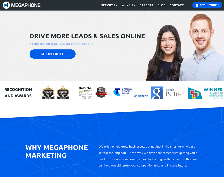
Megaphone is a perfect example of a longer home page that keeps you wanting to scroll as they speak about the benefits of their services, instead of their features.
2. Where to put links to your social media accounts
I see a lot of websites with social icons in their main header menus, or even in the ‘top bar’ of their websites.
But why would you want someone to leave your website as soon as they land on it?
Yes, you want to build up your social following. But you also want a user to spend some time on your website before they go to your social media accounts and get sucked into the social media black hole.
A better place to put links to your social media accounts is in your footer, where they can still be found by website viewers. But also not distract them from your content.
Related post: How to organise your online business to avoid overwhelm & maximise your time
3. Your branding is important
Why is branding important? Because it builds trust with your audience.
A website that doesn’t have clear branding will appear confusing to your audience, and give them the impression that your products/services are low quality.
A website with good branding will have the following things:
3.1 Only use up to two different fonts throughout your site
If you can, you want to use at least one of the fonts that has been used in your logo throughout your site. Providing the font is legible of course.
If you can’t use the same font as your logo, go for a similar font. So for example, if your logo uses a serif font, use a serif font on your website.
Avoid script fonts that are hard to read!
You then want to use your chosen website fonts throughout the rest of your digital design materials. Like Facebook and Instagram posts, your media kit etc.
3.2 Only use up to four colours throughout your site
Again, you want to use the colours that are in your logo so that you have consistent branding.
If your logo only has one or two colours, you can visit Colour Lovers and get some inspiration for colours to pair together.
Make sure that you are choosing colours relevant to your business and appealing to your audience though.
If you are selling kids toys for example, bright, fun colours would be more appealing compared to blacks and greys.
3.3 Keep your images consistent
Choose a theme you would like your website images to have and stick with it.
This could be images with bright lighting, images that are moody, or images that follow a colour theme.
If you have access to Photoshop, a great idea would be to add the same colour overlay or filter to all your main website images to create a really strong consistency.
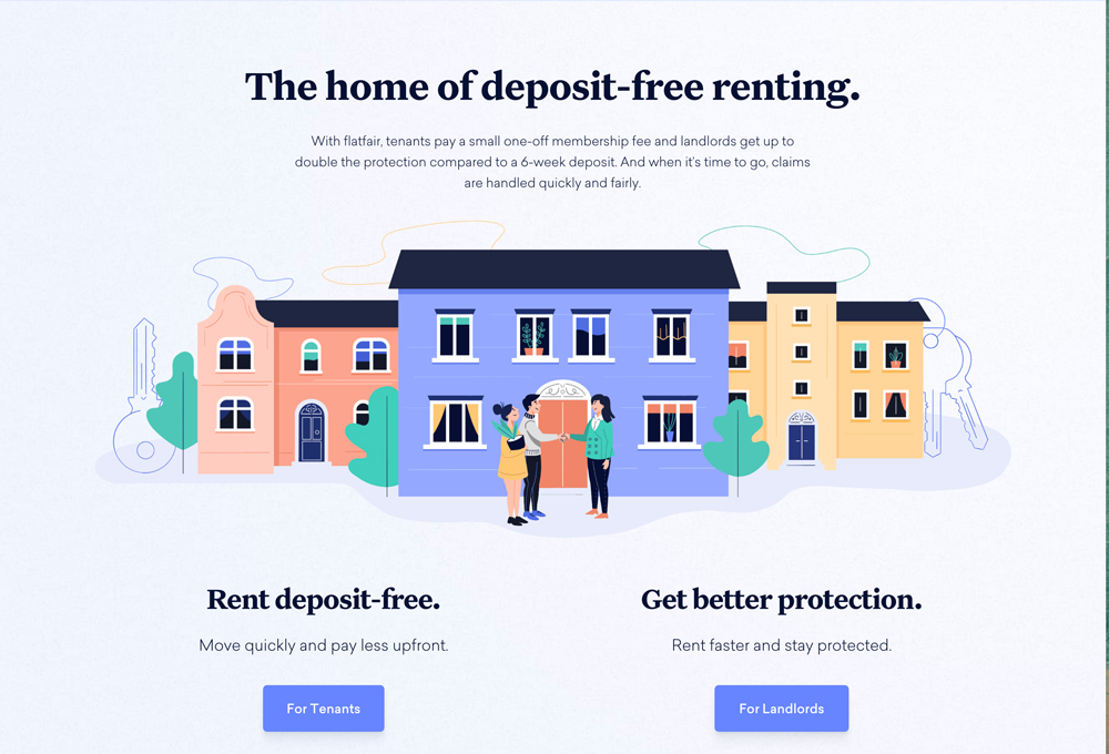
Flatfair has opted for fun vector images throughout their site rather than images of actual people. By using the graphics they have created a really strong brand, and come across as trustworthy and organised.
4. You should have a mailing list and an easy way for customers to sign up
Do you have a mailing list? A mailing list is a collection of your customers (or potential customers) email addresses, and it is super important.
Because what is the use of launching a new product or service and not having anyone to launch to?
The important thing though, is to make sure that your mailing list sign up form is easy to locate, and also appealing to your audience. People are a lot less willing to give up their email these days, so you need to make it worth their while. However you also only want to capture emails of people who are actually interested in your content! There’s no use having a mailing list of 5000 people who never open your emails.
My mailing list opt-in form is direct and to the point. I have chosen not to swap a freebie for email addresses, but rather give my freebie away for, well….free. As I only want subscribers who will benefit from my content, it’s a win win for both of us. Here’s my opt-in form again just in case you skimmed passed it up there ^:
[thrive_leads id=’87585′]
5. Test your website on mobile view!
So you’ve created your website design and it looks great on your computer. But how about other devices?
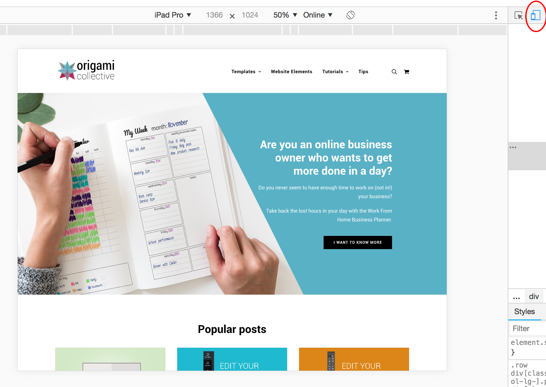
If you aren’t using it already, I would highly recommend installing Google Chrome on your computer. It allows you to see what you website looks like on other drives.
You just need to right click anywhere on your website and select ‘inspect’. You then select the device icon from the top menu bar (circled in red on my screen shot below). This button allows you to toggle between desktop view and mobile view:
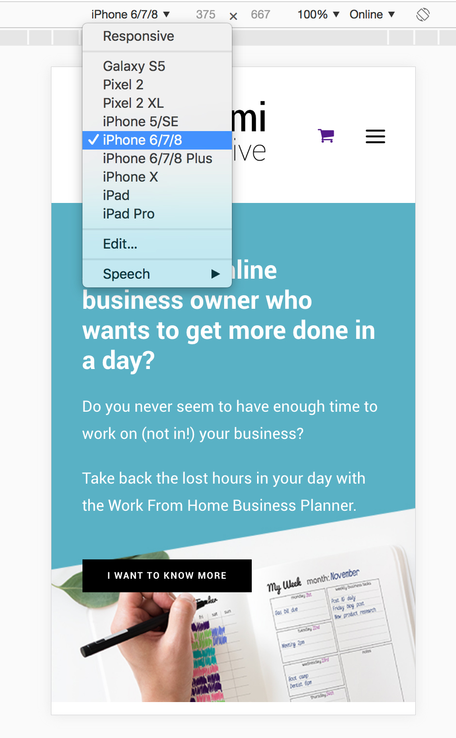
You can then use the drop down box to select from different mobile devices:
Whilst it would be really time consuming to get your site looking perfect on every device, I would at least make sure that your site is 70% there across all devices.
6. Back yourself by investing in your business
Whilst this isn’t so much about your website design, I still feel that it is a really important point.
When I created my first website design a few years ago, I went with a free WordPress theme and spent hours and hours on custom coding just to get it to look how I wanted it to look.
I also spent hours and hours searching for the perfect free stock image.
I opted for the cheapest hosting there was, and my website was sloooooooow.
See where I’m going with this?
When you are running your own online business, time is money. What is your time worth?
Would you be better off buying that $60 theme that is absolutely perfect and has a one click demo install so you can get up and running right away. Or would you prefer to spend hours on a free theme like I did, when I could have actually spent that time creating content and products to sell!
Your business may not be making any money yet, but that is exactly why every single minute of your time is precious. And for me, anything that saves me a bit of time is worth the money.
Care to share your website design?
If you’ve recently launched your own website, or redesigned an old website, I would love to see it! Pop down a link to it in the comments below, and let me know what you love about your website design!